Introduction
Have you ever wondered how companies decide which products to stock more of, or how weather forecasters predict rainfall patterns? The answer often lies in a simple yet powerful statistical concept called relative frequency. You might think statistics sounds complicated, but relative frequency is something you actually use in everyday life without even realizing it.
When you check how often it rains in your city before planning a trip, you’re thinking about relative frequency. When you notice that your favorite coffee shop is always crowded on Monday mornings, you’re observing relative frequency in action. This concept helps us make sense of the world by turning raw numbers into meaningful patterns we can actually use.
In this guide, you’ll discover what relative frequency really means, how to calculate it easily, and why it matters in your daily decisions. Whether you’re a student tackling statistics homework or someone who just wants to understand data better, this article breaks everything down in simple terms you can grasp right away.
What Is Relative Frequency?
Relative frequency tells you how often something happens compared to the total number of times it could happen. Think of it as a way to express probability based on actual observations rather than theoretical predictions.
The basic idea is straightforward. You count how many times an event occurs. Then you divide that number by the total number of observations. The result gives you a decimal or percentage that shows the proportion of times that event happened.
For example, imagine you flip a coin 100 times. Heads comes up 48 times. The relative frequency of getting heads is 48 divided by 100, which equals 0.48 or 48%. This tells you that in your experiment, heads appeared 48% of the time.
Unlike absolute frequency, which just counts occurrences, relative frequency puts those counts in context. Knowing that 20 people bought coffee today means less than knowing that 20 out of 25 customers bought coffee. That relative frequency of 0.80 or 80% gives you much more useful information.
The Formula: Breaking It Down Simply
The relative frequency formula looks intimidating at first, but it’s actually one of the easiest calculations in statistics. Here’s what you need to know.
Relative Frequency = (Number of times an event occurs) / (Total number of observations)
Let me walk you through this with a real example. Suppose you’re tracking customer preferences at your restaurant. Over one week, you served 200 meals total. Of those meals, 75 were vegetarian dishes.
To find the relative frequency of vegetarian orders, you divide 75 by 200. That gives you 0.375. You can express this as a decimal (0.375), a fraction (3/8), or a percentage (37.5%). All three forms mean the same thing.

The beauty of this formula is its flexibility. You can use it for any type of data. Track website clicks, survey responses, weather patterns, or test scores. The process stays the same every single time.
One key point to remember is that all relative frequencies for a dataset must add up to 1.0 (or 100% if you’re using percentages). This helps you check your work and catch calculation errors quickly.
Why Relative Frequency Matters in Real Life
You encounter relative frequency constantly, even if you don’t call it by that name. Understanding this concept helps you make smarter decisions based on patterns rather than guesswork.
In business, companies use relative frequency to analyze customer behavior. They track which products sell most often relative to total sales. This information guides inventory decisions, marketing strategies, and product development. A store manager who notices that 60% of customers buy snacks at checkout knows exactly where to focus promotional efforts.
Medical researchers rely heavily on relative frequency when studying treatment effectiveness. They compare how often patients improve with a new medication versus a placebo. These relative frequencies become the foundation for determining whether a treatment actually works.
Weather forecasting depends on relative frequency too. When meteorologists say there’s a 70% chance of rain, they’re using historical data. They’ve observed that under similar conditions, it rained 70% of the time in the past. That relative frequency helps you decide whether to carry an umbrella.
Even your personal decisions benefit from understanding relative frequency. When you choose a route to work, you’re mentally calculating which path has the lowest relative frequency of traffic delays based on your experience.
How to Calculate Relative Frequency: Step by Step
Let’s work through a complete example so you can see exactly how this process works from start to finish.
Imagine you’re analyzing customer age groups visiting your bookstore. Over a month, you recorded 500 total customers. Here’s what you observed:
- Ages 0-18: 75 customers
- Ages 19-35: 180 customers
- Ages 36-50: 145 customers
- Ages 51+: 100 customers
Step 1: Identify your total observations. In this case, it’s 500 customers total.
Step 2: Count occurrences for each category. You’ve already done this with your age groups.
Step 3: Divide each category count by the total. Let’s calculate:
- Ages 0-18: 75 ÷ 500 = 0.15 (15%)
- Ages 19-35: 180 ÷ 500 = 0.36 (36%)
- Ages 36-50: 145 ÷ 500 = 0.29 (29%)
- Ages 51+: 100 ÷ 500 = 0.20 (20%)
Step 4: Verify your work. Add all relative frequencies together. They should equal 1.0 or 100%. In our example: 0.15 + 0.36 + 0.29 + 0.20 = 1.0. Perfect.
Now you know that 36% of your customers fall in the 19-35 age range. This information helps you select appropriate books, plan events, and target marketing campaigns effectively.
Relative Frequency vs Cumulative Frequency
These two concepts often confuse people, but they serve different purposes. Understanding the distinction helps you choose the right tool for your analysis.
Relative frequency shows the proportion of times a single event or category occurs. It answers the question, “What percentage of the total does this represent?” Each category stands alone with its own relative frequency.
Cumulative frequency, on the other hand, adds up frequencies as you move through your data. It shows you the running total and helps you understand how much of your data falls below a certain point.
Using our bookstore example from earlier, the cumulative relative frequency for ages 36-50 would include everyone from 0-50 years old. That would be 0.15 + 0.36 + 0.29 = 0.80 or 80%. This tells you that 80% of your customers are 50 years old or younger.
Both measures provide valuable insights. Relative frequency helps you compare individual categories. Cumulative frequency helps you understand distribution patterns and identify percentiles in your data.
When analyzing test scores, for instance, relative frequency shows what percentage of students scored in each grade range. Cumulative frequency tells you what percentage scored at or below a particular grade level.
Creating Relative Frequency Tables
Organizing your data in a table makes patterns instantly visible. Here’s how to build an effective relative frequency table that communicates clearly.
Start with your raw data organized by categories. Include columns for the category name, absolute frequency (raw count), relative frequency (decimal), and percentage. This layout gives readers multiple ways to interpret your findings.
Let’s create a table for a survey about preferred social media platforms. You surveyed 250 people. The results look like this:
| Platform | Frequency | Relative Frequency | Percentage |
|---|---|---|---|
| 90 | 0.36 | 36% | |
| 65 | 0.26 | 26% | |
| 45 | 0.18 | 18% | |
| TikTok | 35 | 0.14 | 14% |
| Other | 15 | 0.06 | 6% |
| Total | 250 | 1.00 | 100% |
Notice how the table includes totals at the bottom. This helps readers verify accuracy and provides important context. The table format also makes comparisons effortless. You can immediately see that Instagram has more than twice the relative frequency of TikTok.
Good tables include clear labels, consistent formatting, and appropriate rounding. Two decimal places usually work well for relative frequencies, though you might use three for very precise scientific data.
Common Applications Across Different Fields
Relative frequency appears in virtually every field that deals with data. Let’s explore how different professionals use this concept daily.
Education: Teachers use relative frequency to analyze test performance. If 18 out of 30 students scored above 80%, that relative frequency of 0.60 or 60% helps teachers evaluate whether their instruction was effective. They can identify which concepts need more attention based on these patterns.
Marketing: Digital marketers track click-through rates, which are essentially relative frequencies. If 500 people click on an ad out of 10,000 impressions, the relative frequency is 0.05 or 5%. This metric determines advertising effectiveness and budget allocation.
Manufacturing: Quality control specialists monitor defect rates using relative frequency. When 15 defective products appear in a batch of 1,000 items, that 1.5% relative frequency helps determine whether production processes need adjustment.
Sports Analytics: Coaches and analysts use relative frequency to evaluate player performance. A basketball player who makes 45 free throws out of 50 attempts has a relative frequency of 0.90 or 90%. This becomes part of strategic decision-making during games.
Healthcare: Epidemiologists track disease occurrence using relative frequency. They calculate what proportion of a population develops certain conditions. These relative frequencies help allocate medical resources and plan public health interventions.
The versatility of relative frequency makes it an essential tool regardless of your profession or interests.
Interpreting Results: What Do the Numbers Mean?
Calculating relative frequency is just the first step. The real skill lies in understanding what those numbers tell you about your situation.
A high relative frequency indicates that an event happens often compared to other possibilities. If customer complaints have a relative frequency of 0.05 or 5%, that might seem small. But if your competitor has a complaint rate of 0.01 or 1%, your rate is actually five times higher. Context matters enormously.
Consider sample size when interpreting results. A relative frequency of 0.60 based on 10 observations is far less reliable than the same relative frequency based on 1,000 observations. Larger samples give you more confidence in your findings.
Watch out for misleading patterns in small datasets. If you flip a coin five times and get heads four times, the relative frequency is 0.80 or 80%. But this doesn’t mean the coin is unfair. Random variation causes such results in small samples. Always consider whether your sample size is large enough to draw meaningful conclusions.
Relative frequency helps you spot trends over time. If customer returns had a relative frequency of 0.08 last quarter and 0.12 this quarter, you’ve seen a 50% increase. This signals a problem that needs investigation, even though 12% might not sound alarming on its own.
Limitations and What to Watch Out For
While relative frequency is incredibly useful, it has limitations you need to understand. Being aware of these helps you avoid common analytical mistakes.
Relative frequency describes what happened in your sample. It doesn’t automatically predict what will happen in the future. Past patterns provide clues, but they’re not guarantees. Just because it rained 60% of days last month doesn’t mean it will rain 60% of days next month.
Biased samples create misleading relative frequencies. If you survey people about exercise habits only at a gym, your results won’t represent the general population. The relative frequency of daily exercise will be artificially high because you sampled from an active group.
Small sample sizes produce unreliable relative frequencies. Those coin flip examples I mentioned earlier demonstrate this perfectly. You need adequate sample sizes before trusting your relative frequency calculations as indicators of real patterns.
Confusing correlation with causation is another trap. Suppose you find that days with high ice cream sales have a high relative frequency of drowning incidents. The relative frequency is real, but ice cream doesn’t cause drowning. Both simply happen more often in summer when people swim more and eat more ice cream.
Time periods matter too. Retail sales relative frequencies look very different during holiday seasons versus regular months. Always specify the time frame for your data to provide proper context.
Practical Tips for Working with Relative Frequency
Here are some strategies I’ve found helpful when working with relative frequency in real projects.
Always double-check your totals. Before calculating any relative frequencies, verify that your individual frequencies add up to your stated total. This simple check catches data entry errors early.
Use technology wisely. Spreadsheet software makes calculations effortless and reduces arithmetic errors. Set up formulas once, and you can update your entire table instantly when new data arrives.
Round appropriately. Too many decimal places create false precision. For most purposes, two decimal places work perfectly. Scientific applications might need three, but rarely more than that.
Present percentages for general audiences. While decimals are mathematically cleaner, most people find percentages more intuitive. Know your audience and format accordingly.
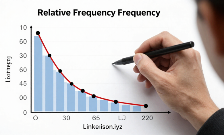
Create visual representations. Bar charts and pie charts make relative frequency data instantly understandable. A quick glance at a well-designed chart communicates what paragraphs of text cannot.
Compare relative frequencies, not absolute numbers. Saying “50 customers complained” means little without context. Saying “2% of customers complained” provides useful perspective, especially when compared to industry standards or past performance.
Document your methodology. Note your sample size, time period, and data collection methods. This transparency helps others evaluate your findings appropriately and reproduce your analysis if needed.
Conclusion
Relative frequency transforms raw numbers into meaningful insights you can actually use. This simple statistical tool helps you understand patterns, make predictions, and communicate data effectively to others.
You’ve learned how to calculate relative frequency using a straightforward formula. You’ve seen real-world applications across business, education, healthcare, and daily life. You now understand how to interpret results thoughtfully while avoiding common pitfalls that lead to wrong conclusions.
The beauty of relative frequency lies in its accessibility. You don’t need advanced mathematical skills to use this concept effectively. With practice, calculating and interpreting relative frequencies becomes second nature. You’ll start noticing patterns everywhere and making better data-driven decisions.
Start applying relative frequency to your own situations today. Track something you’re curious about for a week or month. Calculate the relative frequencies. See what patterns emerge. You might be surprised by what the numbers reveal about your habits, preferences, or business operations.
What patterns in your life or work would benefit from relative frequency analysis? The tools are in your hands now.
FAQs
What is relative frequency in simple terms?
Relative frequency is how often something happens divided by the total number of times it could happen. It expresses this as a decimal or percentage, showing you the proportion rather than just the count. For example, if 30 out of 100 customers buy a product, the relative frequency is 0.30 or 30%.
How is relative frequency different from probability?
Relative frequency is based on actual observed data from experiments or real events. Probability is theoretical, based on what should happen mathematically. Relative frequency can estimate probability, and as sample sizes grow larger, relative frequency typically gets closer to theoretical probability.
Can relative frequency be greater than 1?
No, relative frequency cannot exceed 1.0 or 100%. Since it represents a proportion of the total, the maximum possible value is when something happens every single time, which equals 1.0. If your calculation gives you a number greater than 1, you’ve made an error somewhere.
What sample size do I need for reliable relative frequency?
Generally, larger is better, but it depends on your situation. For most practical purposes, aim for at least 30 observations. Statistical reliability improves significantly with samples of 100 or more. Very rare events need much larger samples to establish accurate relative frequencies.
How do you convert relative frequency to percentage?
Multiply the relative frequency by 100. If your relative frequency is 0.25, multiply by 100 to get 25%. If you calculated it as a fraction like 3/4, convert to decimal first (0.75), then multiply by 100 to get 75%. Both methods work perfectly fine.
When should I use relative frequency instead of absolute frequency?
Use relative frequency when you need to compare different groups or datasets of different sizes. Absolute frequency (raw counts) works fine when all groups are the same size, but relative frequency lets you make fair comparisons between unequal groups by standardizing everything to proportions.
What’s the relationship between relative frequency and histograms?
Histograms often display relative frequency on the vertical axis instead of raw counts. This makes the histogram useful for comparing distributions with different sample sizes. The height of each bar represents the relative frequency or proportion of observations falling within that range.
Can relative frequency be negative?
No, relative frequency cannot be negative. You’re dividing a count by a total, and both numbers must be zero or positive. The range for relative frequency is always from 0 to 1 (or 0% to 100%). A relative frequency of 0 means the event never occurred in your sample.
How does relative frequency help with predictions?
Relative frequency from past data helps predict future outcomes by showing historical patterns. If a machine malfunction has a relative frequency of 0.05 based on a year of data, you can estimate about 5% of future runs might have issues. Remember that predictions are estimates, not certainties.
What software is best for calculating relative frequency?
Excel and Google Sheets work excellently for basic relative frequency calculations. Statistical software like R, Python (with pandas), SPSS, or SAS offers more advanced features. For most everyday applications, spreadsheet software provides everything you need without the learning curve of specialized programs.
Read More : Laura Barron Lopez